From superneturals to deep hues, our editors' picks will provide you a rainbow of inspiration.
Why These Colors Work: Looking at this room of subdued peaches and tans, you might not think "contrast." But the accent pieces -- end tables painted Lancaster Blue (12) and a round tray coated in Babouche yellow (9) -- are in complementary colors that bring just enough modern pop to the formal setting. We unified two different end tables of the same height by painting them in the same color. Lampshades are often lined in peach to tint the light. Here, we painted the exterior of the shades to project the flattering color into the space (use blackout shades, otherwise your brushstrokes will show when the light is on).
Why These Colors Work: Three shades of green mingle by a window, showing how well superneutrals get along. Painted the grayish hue of a blue fir (4), the handsome wooden valance has a strong cutout shape. We accented its silhouette with a crisp stenciled border in light apple green (5), also applied to the picture frame. The stool got a similar treatment. We painted the legs a deeper shade of teal (2), leaving the raised edges the original gray color.
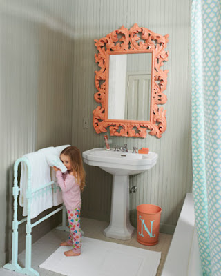
Why These Colors Work: Bathed in soft gray (3) and enlivened with peach (7), what's normally a utilitarian space becomes warm and welcoming. This mirror's carved-wood frame is an unexpected flourish. We painted its acanthus-leaf curls in peach to stand out against and harmonize with the gray bead board. A wooden towel rack -- the sort often found at flea markets and country antiques stores -- was coated in sky blue (1). The monogrammed trash bin, embellished with peach and blue, pulls the palette together.
Why These Colors Work: Among the easiest colors to add to a room, grayish blue greens are layered here to create a calming effect in a home office. The warm gray wall color (14) was also used on the sides and interiors of the open-back bookcases, giving them the feel of built-ins. A minty green on the case's front (16), applied with a short roller, adds crisp definition. The same paint was used on storage baskets stowed in the lower cubbies. Rounding out the palette, the desk is painted a misty, barely there grayish blue green (13). Because the wood of this Ikea piece was so smooth to begin with, we chose glossy paint, adding shine to the many textures in the space.


