If you’ve read my blog before or have followed it, you will know that it takes a LOT to impress me. I’m one of those kind of people who don’t like to have what everyone else has. I don’t like the normal, the conformed, the popular. There are exceptions of course, but for the most part, I like unusual, eclectic, foreign and different.
This month when I received my Architectural Digest in the mail I was met by the handsome Gerard Butler sitting in a chair in his Chelsea loft in New York. Although Gerard (Gerry as his friends call him I believe) looked good..honest eyes… I was not impressed by his surroundings. However, upon turning the pages and coming upon the article featuring his loft, I had one of those wow moments! Wow! This loft is different. Wow! This place has character! Wow! This is a man who isn’t afraid of inventing a new landscape. Wow! I found a new design aesthetic I really like!
The VERY handsome Gerard Butler.
This is the picture that I love! The exposed beams, the worn walls, the casual furniture, the rudimentary dining set, the crystal chandeliers! Love, love, love! It’s always been a dream to have a loft space of my own!
A stone lion’s head from an old library was used in Butler’s theater area.
The dining area with the rustic dining set and three fabulous chandeliers lighting the area. If you can’t decide on one chandelier style, go with them all!
The theater room. The columns frame the screen and the furnishings are comfy and casual.
The kitchen’s cabinetry was made out of leftover flooring materials. Love sustainable design! The use of glamorous crystal chandeliers juxtaposed against distressed wood and worn walls is fabulous!
Another view of the kitchen, but this pic has a different center island. Perhaps this was the first go-round with Designer Elvis Restaino? I like the black island above better.
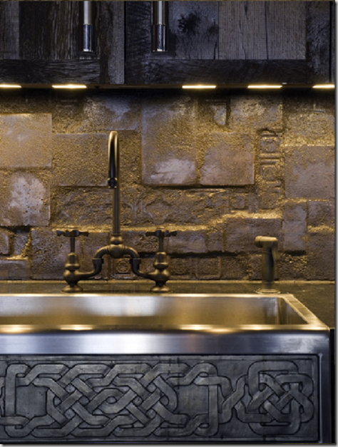
The stone-like tiles used as a black splash against stainless sink with Celtic markings is another juxtaposition that I find intriguing. It’s THIS kind of design that is interesting!
A view into Butler’s office. I love tall windows that open up to the world.
I believe this is Elvis Restaino in Butler’s loft. Restaino is an accomplished set designer, working on such sets as Star Wars and Moulin Rouge. Check out his website here. What a talented man!
Entranceway before…
and after…
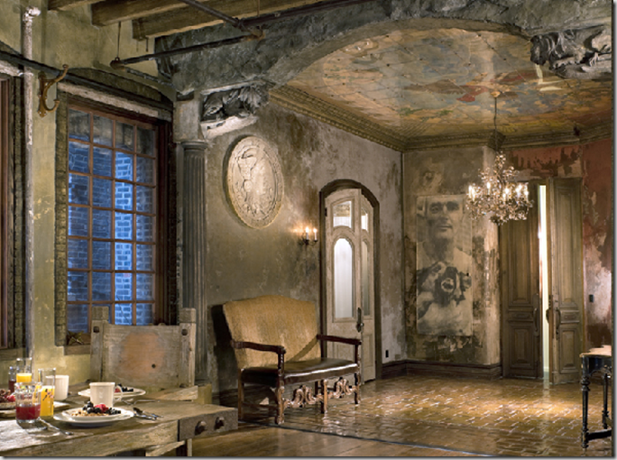
and after…. ahhhh….. Note the mural on the ceiling, the crystal chandelier, the worn walls and the archway and columns separating the space from the rest of the loft. Perfect!
Now if Restaino would only come help me envision my home!
Have a wonderful week everyone!
Life's not always fair. Sometimes you can get a splinter even sliding down a rainbow. ~Terri Guillemets


