I’d like to present a new regular feature called “Principles of Good Design”. For this first post and in reference to the new year, let’s talk about movement in design. Not design movements, such as De Stijl or Bauhaus. I’m talking about looking at a space and seeing the movement that occurs as an element in that space.
In everyday design, architecture, art and interior design, movement is an important force that creates excitement. It keeps the eye roaming and provides interest and hopefully curiosity. By arranging a room in a certain way, the designer forces the eye to move in a particular way, either on purpose or accidentally. If a designer is good, it will be on purpose. Graduation of sizes, shapes, color, light and dark can all have an effect on movement.
Repetition in a room can also create movement, as well as rhythm. Similarity of elements or flowing, circular elements will give a more connected flowing rhythm to a room, while jagged or unrelated elements will create a more unsettling, dynamic scene.
Action is also another way to force movement in design. Below I provide some photos of rooms that show all of these elements. See if you agree that there is movement in these spaces.
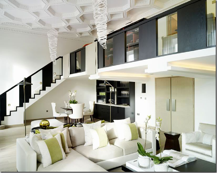
In this living space, Designer Kelly Hoppen creates movement on many levels (no pun intended). The repeating pattern of the wood and glass up the staircase and across the balcony draws your eye up along it. The pattern of the ceiling is in itself a repeating pattern that commands attention. Add to that the tornado inspired light fixtures, which are the epitome of movement.
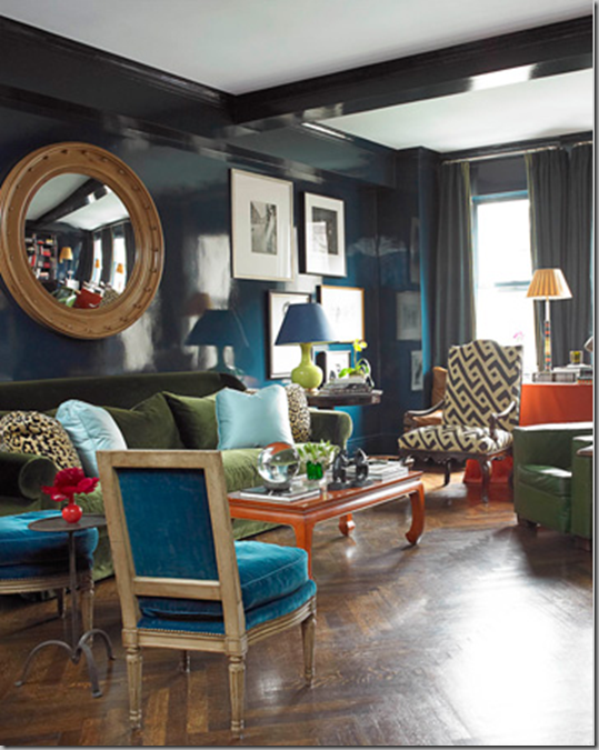
In this living room, Designer Miles Redd used multiple colors and pattern that help your eye weave through the space. The blue lacquered walls (in Farrow & Ball’s Hague Blue) unify the space. House Beautiful, July 2009.
The different levels of height in this space are what creates movement in this space. From the chair, to the headboard, to the picture frames and up to the roman shade and chandelier, your eye keeps climbing. Designer Amanda Nisbet. House Beautiful, March 2008.
Designer Ginger Barber created literal movement with the striped floor covering, which coordinate with the steps in the foreground. The camel colored check slipcovered chair coordinate with the organic shades in the window, which draw the eye around the room as well. House Beautiful, July 2009.
Designer Robin Bell uses a unifying color of periwinkle blue and a smart stencil all along the crown molding to keep the eye moving in this master bedroom. Featured in House Beautiful, November 2007.
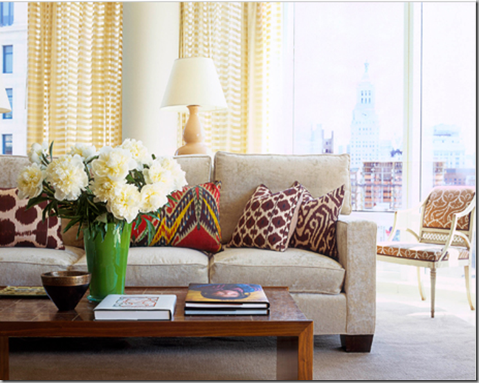
Movement is created in this living space by the use of various patterns in the drapery, pillows and chair. A vivid green vase draws dramatic attention as well. Designer Eric Cohler. House Beautiful, October 2008.
Movement doesn’t have to be loud and chaotic. In this master bedroom, the movement is in the color trail that goes from the bed, to the roman shades and back down to the lap blanket covering the chaise lounge. Designer Lynn Morgan. House Beautiful, April 2009.
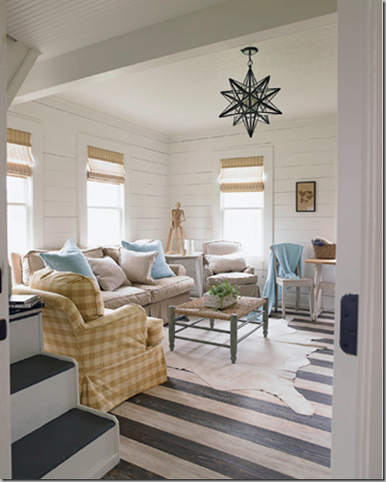
Designers Marshall Watson and Wendy Monette created a beachy Hampton’s feel with this living space. Again, the use of patterns, various sofa styles and pattern (on the floor in stripes and on the light fixture above) create a movement in the room. The stairwell as well as the molding detail on the back wall also draw your eye to the rear of the room. This space is visually stimulating, don’t you think? House Beautiful, September 2008.
The artwork on the wall placed unevenly, as well as the patterns in the fabrics and carpet and the Moroccan headboard make this interesting. Designer Stephen Shubel. House Beautiful, January 2009.
This small living room features plants that help breath life into and around the room. A sense of wild is incorporated into the room with the zebra striped pillows, bird on the mantle and elephant plant stand on the hearth creating added interest. Designer by Moises Esquenazi . House Beautiful. July 2008.
In this small bedroom, Designer John Willey created movement by putting two similar patterns together, in the carpet and bedding, so that the eye runs from wall to wall without distraction. House Beautiful. March 2009.
In this traditional and calm space, placement of the furniture, as well as the various heights of the furniture add interest. Because the drapery, artwork and walls have similar color, the eye moves vertically as well. Designer Ginger Barber. House Beautiful. November 2008.
Designer Jonathan Berger punched up this entry space with Benjamin Moore's Razzle Dazzle paint. Coupled with the stark black and white stairs and wainscoting, it provides a visually interesting setting. House Beautiful. July 2009.
L.A. artist Jorge Rafael designed this living room fantastically. The green color of the chairs stop the eye mid-point in the room, but then it is drawn to the back wall with the incredible floor to ceiling artwork of Lauren Bacall. The eye also undulates on the right wall with the recessed fireplace and the beams that jut into the light colored wall. House Beautiful. June 2008 issue.
The wood clock in the back room draws the eye all the way down the hall. Add to that the wood elements and similar color that unify the space… the wood floor, the wood cabinet, chair and the brown patterned rug and you’ve got a space that is welcoming and inviting. House Beautiful. April 2007.
Kitchen spaces are hard places to create movement, because they are typically so sterile (even the homey ones). But, here homeowner Jamie Gottschall created a kitchen that is visually stimulating, different and welcoming all at the same time. Her inspiration was Willy Wonka and the Chocolate Factory. House Beautiful. June 2006.
The chandelier with brown shades draws the eye upward. The zebra stool draws the eye downward. The lovely brown wall in between connect the two. Designers David DeMattei and Patrick Wade. House Beautiful. March 2008.
Another kitchen where you just want to keep looking from counter to backsplash to ceiling. The tiles, made from 19th-century French concrete tiles really add punch to this kitchen. The free-standing island is très magnifique! Designer Shannon Bowers. House Beautiful. November 2007.
Fresh and clean describe this living space where pattern is the key player. Solid furniture pieces like this pea green sofa and Arne Jacobsen Swan chair (Design Within Reach) anchor the space and allow the patterns to play off of one another nicely. House Beautiful. May 2009.
Some tips to create movement in your design:
- Use eclectic pieces. Combining styles, such as a modern metal coffee table with a French settee, a nickel-plated modern mirror with a rustic wood mantle or vintage and new furniture keeps the eye entertained and moving.
- Play with scale. Rooms need various sized pieces to shake things up. Try using very tall and very small items in a room to keep the eye going up and down. Use large vases with branches on tables or a series of small framed pictures across a long wall to create visual significance.
- Add textural pieces. Rough and smooth or old and new finishes really surprise the palette. Do the unexpected!
- Add pops of strong color. Original art, colored vases, bright pillows and flowers in season all count.
- Be playful. Find items with a sense of humor and display them in your home. Flea markets, antique shops or even your local corner store might find just the object you are looking for.
- Repetition is the easy way to create movement.
This may be just the thing you are looking for to make your rooms and spaces come alive. Perhaps you require a space that is more calming? That’s coming up in another post! What else defines or creates movement in a room or space for you?


